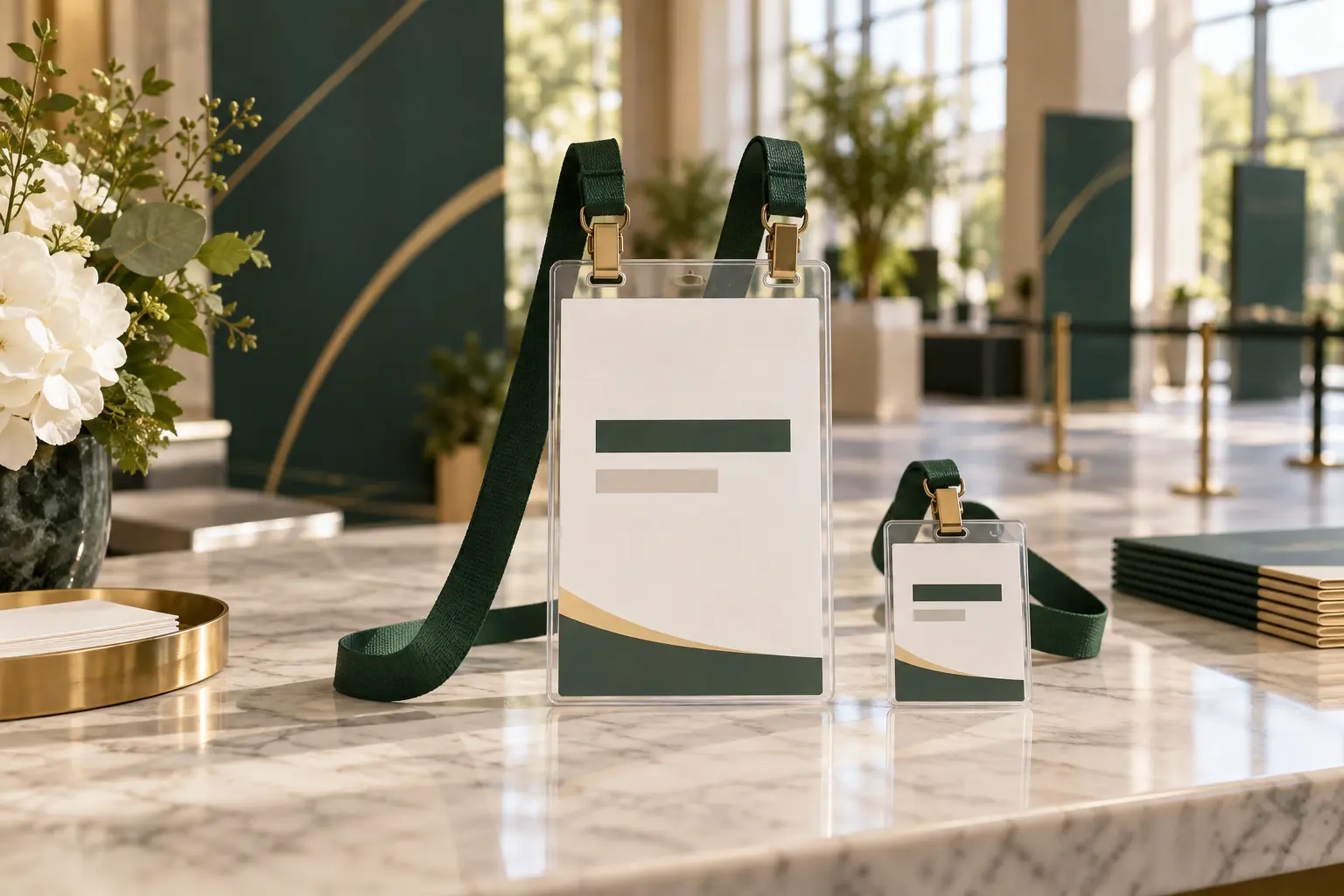
At a networking event, the badge is not decoration. It helps people decide how to address one another, identify an organization and start a conversation without asking the same introductory questions repeatedly. Recent event-community discussions emphasize looking at name tags when approaching people, while organizers continue to debate how much information belongs on larger badges. The practical lesson is that the printed badge, holder and lanyard must be tested as one credential system.
Readability is a chain, not one font-size decision
A large first name can still be hard to read if the badge sits too low, flips backward or reflects overhead lighting. Start with the content hierarchy, then review the physical components that control where the badge rests.
| Element | Buyer decision | Failure to test |
|---|---|---|
| Name hierarchy | Decide which line must be recognized first. | Every line competes at the same visual weight. |
| Badge dimensions | Provide the finished insert size and orientation. | The holder pocket is assumed from an artwork file. |
| Lanyard length | Test where the badge rests on different wearers. | The badge falls below the comfortable viewing zone. |
| Attachment | Match one or two clips to the holder slots. | The badge rotates, tilts or twists. |
| Holder surface | Check glare and pocket fit under venue lighting. | The insert is readable on screen but not on site. |
Start with the conversation distance
Print a full-size badge and ask someone unfamiliar with the design to read the name and company during a normal introduction. Do not zoom in on a monitor. Stand in typical registration and networking lighting, place the badge in its real holder and attach it to the intended strap.
If the person must lean forward, the design may need stronger contrast, less secondary information or a different badge position. Moving every line to a larger font is rarely the best answer because it can make the hierarchy less clear.
Choose badge size from the information that must stay visible
A small badge may be enough for a name and company. A larger badge is useful when the organizer also needs a QR code, role, session access information, map or schedule. Larger is not automatically more readable: additional space often attracts additional content.
Portrait badges
Portrait credentials usually work well with one centered slot and one clip. Confirm that the insert does not slide inside an oversized pocket and that the clip does not cover the top line.
Landscape badges
A wide credential can rotate around a central attachment. Two clips may improve stability when the holder or badge has correctly spaced holes. Give the manufacturer the center-to-center spacing rather than asking for a “standard” double clip.
Lanyard length controls where the badge lives
Specify finished drop length or total circumference using the supplier's measurement method. Wearer height, clothing and badge weight change the final position. A heavy 4 × 6 holder may pull a soft strap differently from a lightweight laminated card.
For an event with varied attendees, test the same sample on several people and with typical clothing. If the credential must be scanned frequently, check whether users can present it without removing the lanyard or pulling the holder at an awkward angle.
Strap width should support branding without competing with the badge
A wider strap gives sponsor artwork and repeated logos more printable area. It also becomes a stronger visual element. Decide whether the primary job is sponsor visibility, role identification, comfort or a restrained professional appearance. The badge must remain the main source of personal information.
Run a five-minute physical check before approval
- Print the final badge at 100% scale.
- Insert it into the actual holder or a dimensionally correct sample.
- Attach the specified clip or double-clip lanyard.
- Walk, sit and turn to see whether it flips or twists.
- Read the name and company in realistic venue light.
Photograph the assembled reference from the front and back. That image is useful when approving production, training registration staff and checking the delivered packing.
RFQ details for a readable credential system
Send the attendee quantity, quantity by role or design, finished insert dimensions, orientation, holder pocket dimensions, hole or slot spacing, strap width, lanyard length, attachment, artwork, assembly requirement, packing groups, destination and required arrival date.
For related specifications, review our 4 × 6 conference badge guide and badge-holder lanyard kits.
Bottom line
Conference badge readability depends on content hierarchy and physical behavior. Approve the name badge, holder and lanyard together so the credential remains visible during the conversations it was designed to support.
Frequently asked questions
What makes a conference badge easy to read?
A clear name hierarchy, sufficient contrast, a holder large enough for the insert, and a lanyard length that keeps the badge near the upper torso all help. Test the complete credential on different wearers before production.
Should a networking badge use one clip or two?
A single central clip can work for portrait badges. A wide landscape badge may sit flatter with two correctly spaced attachment points. The decision should follow the finished badge, not a generic rule.
Can the lanyard fix a poorly designed badge?
No. The lanyard can improve position and stability, but it cannot correct small type, weak contrast or an overcrowded badge layout.
This article was informed by current event-community discussions about practical planning problems. The manufacturing and specification recommendations are LANYVO's original guidance.
Reddit discussion 1: event-community context used for this guide
Reddit discussion 2: event-community context used for this guide